Website redesign for the Herts SU
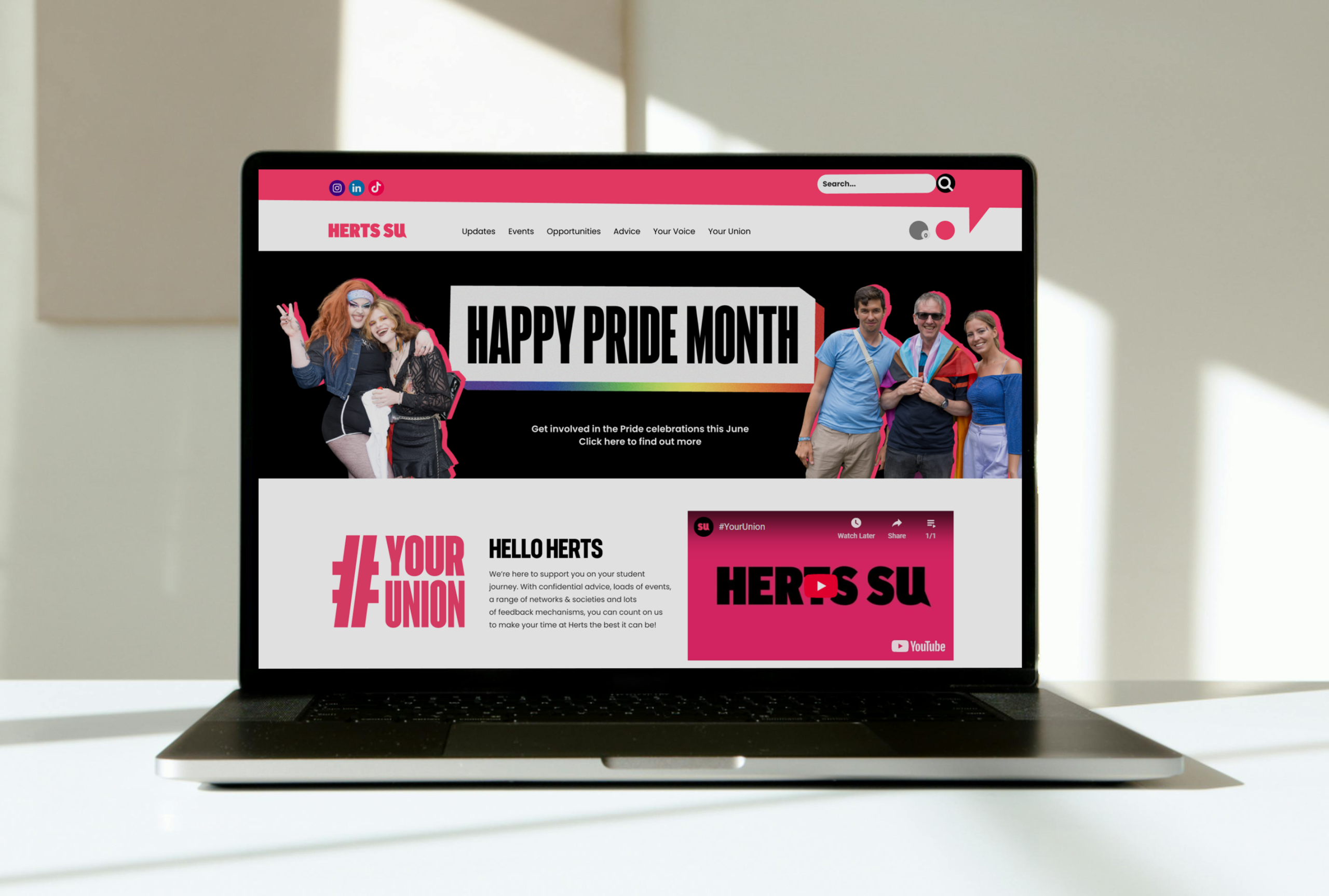
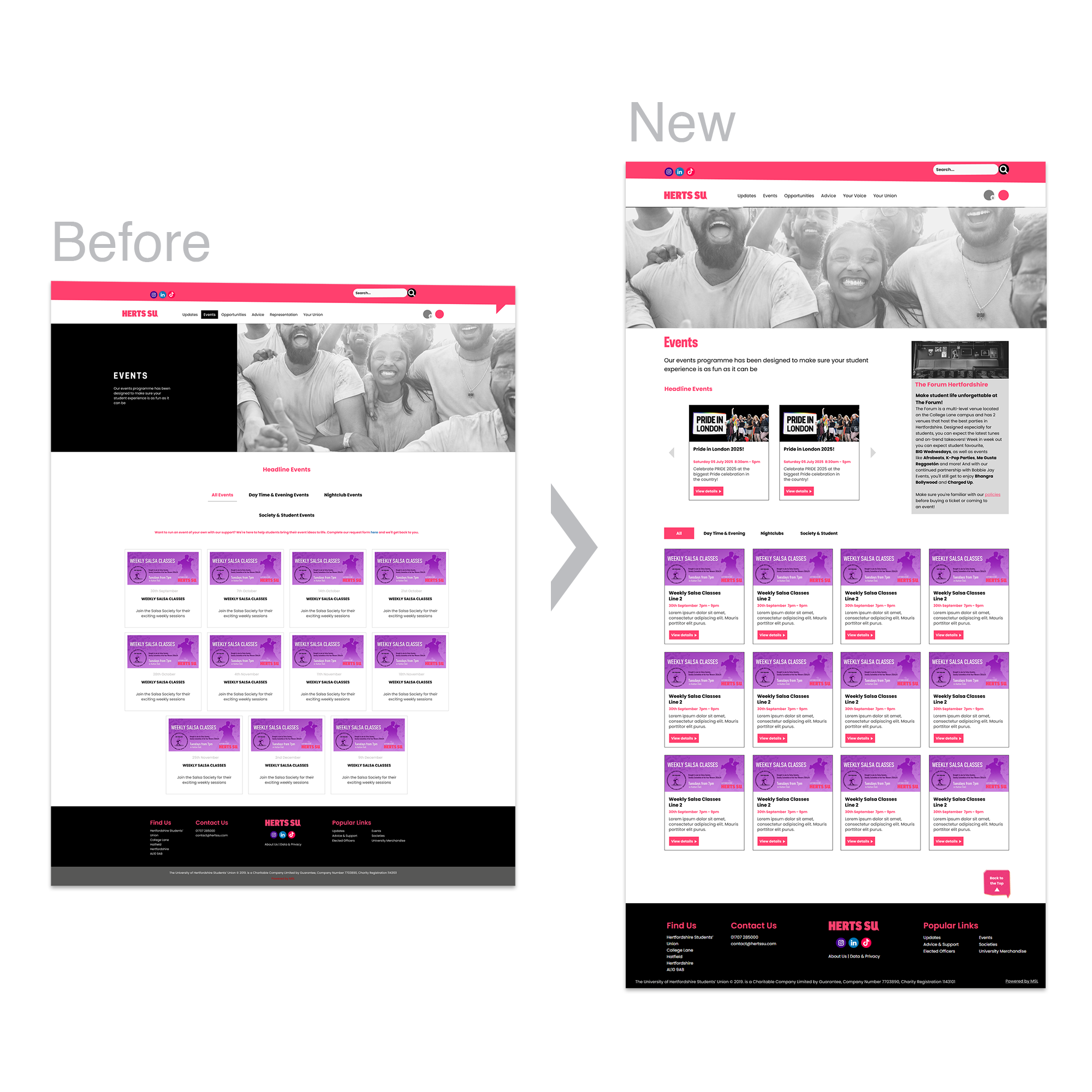
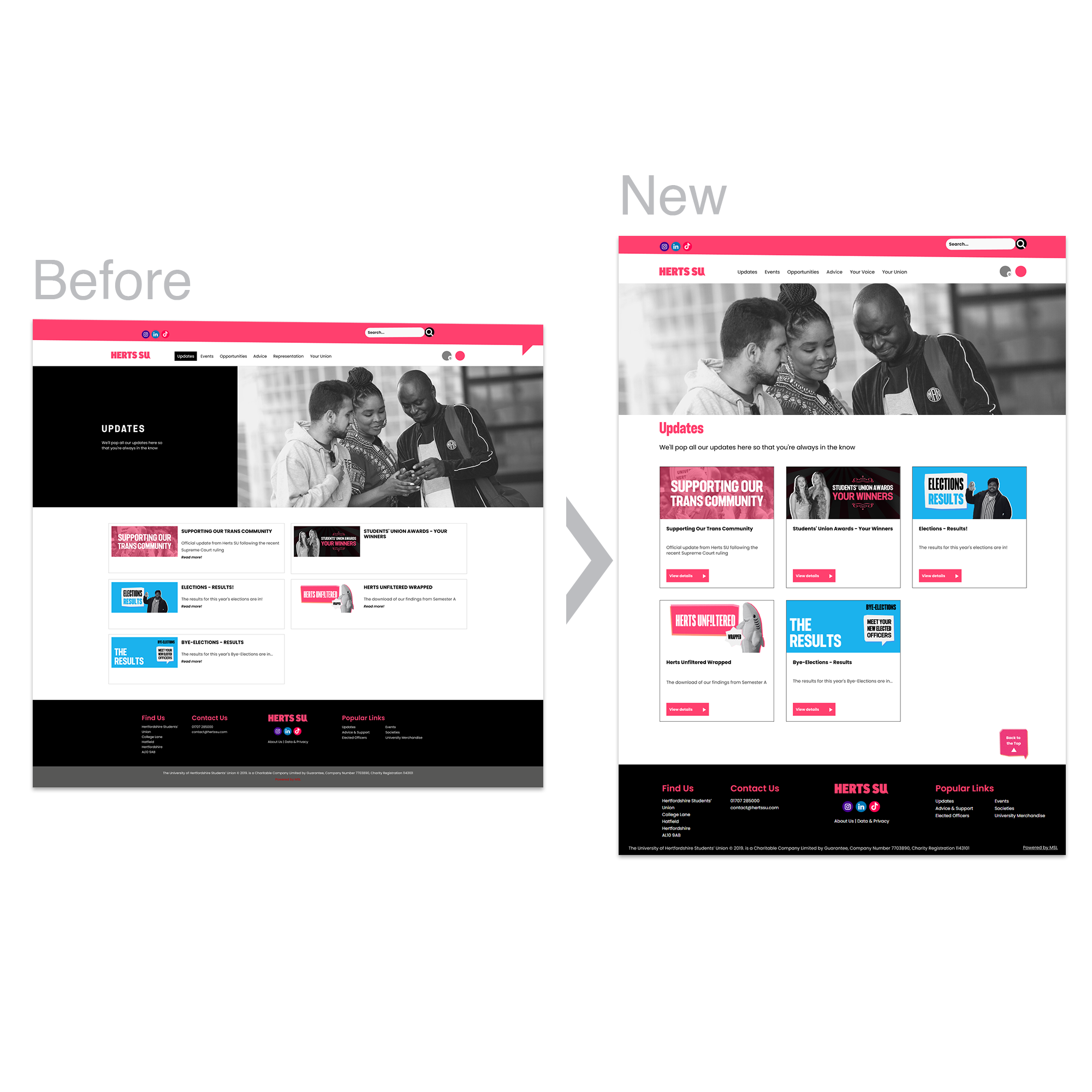
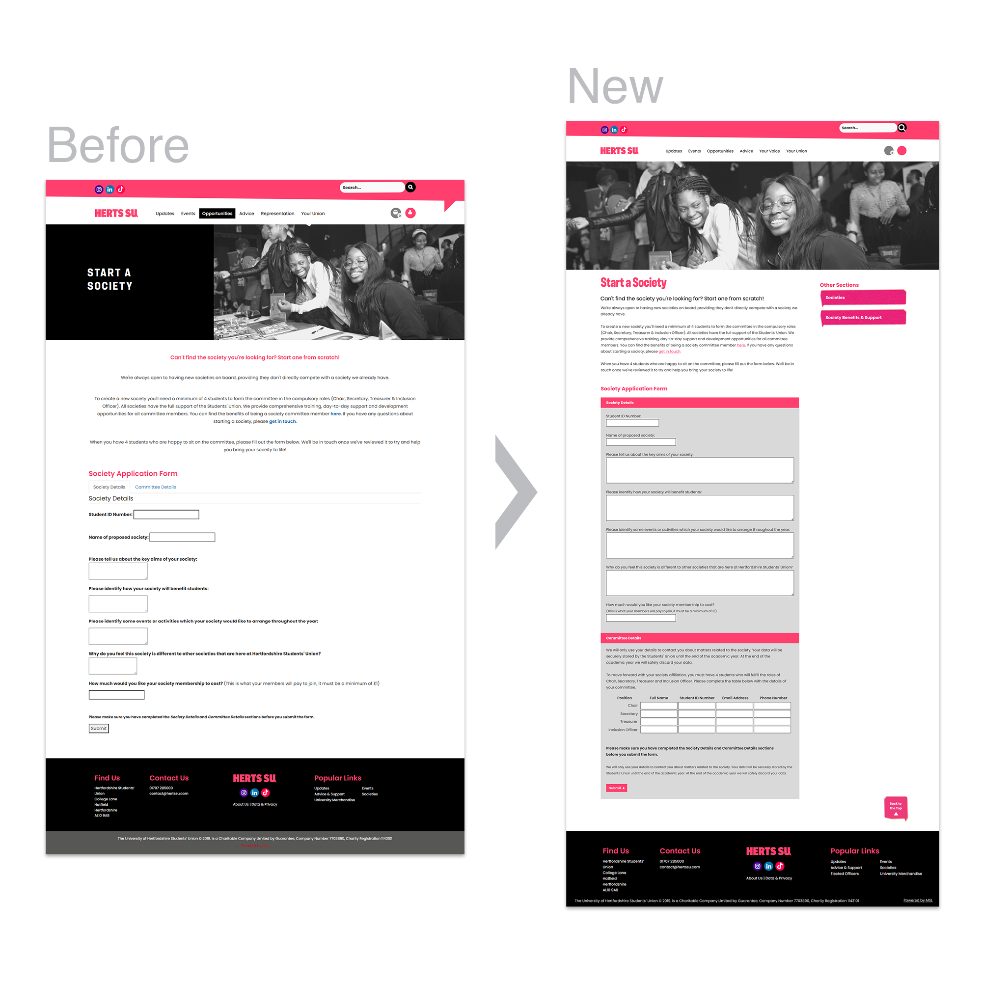
The Hertfordshire Students’ Union asked me to redesign their neglected website, which had outdated content and inconsistent branding. My role was to work with the full marketing team to restructure the site, design new layouts in Figma, and refine visuals with the in-house designer. Once approved, I implemented the build within their MSL content management system, combining coded components with editable templates so staff across the Union could manage updates.
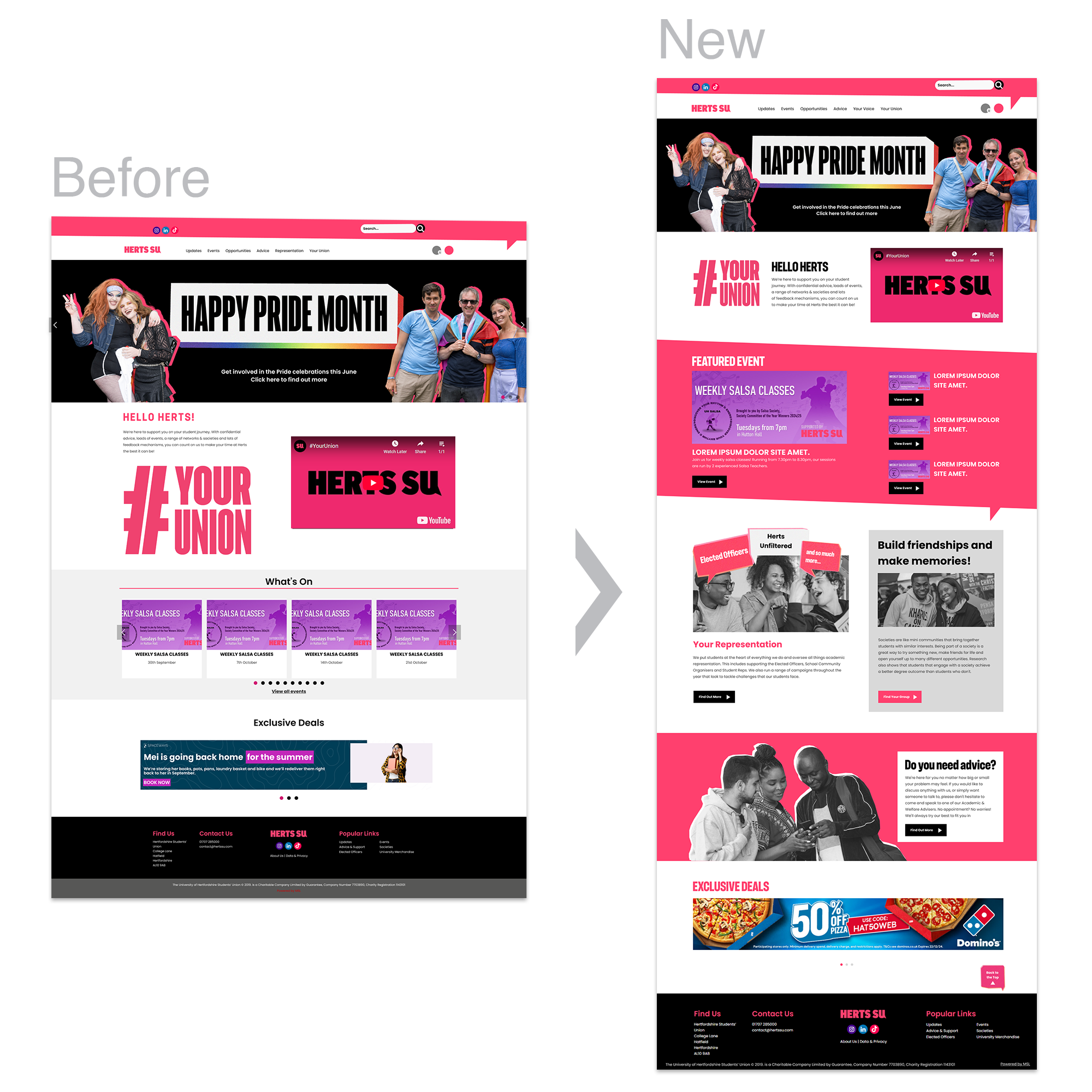
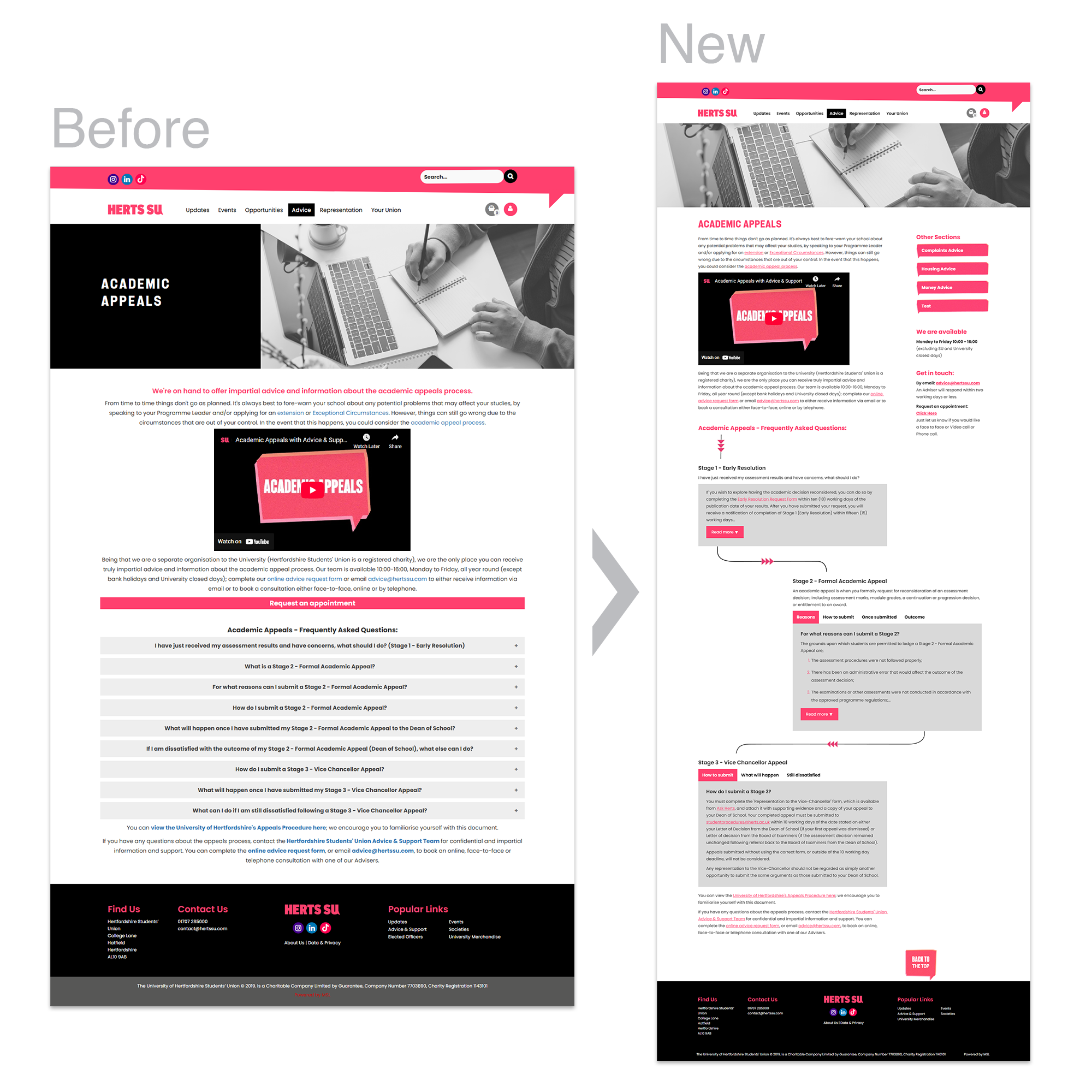
To improve usability, I created a consistent layout system based on their existing brand, introduced a homepage that highlighted more of the Union’s services, and added a sidebar for clearer navigation. This sidebar reduced clicks, brought important details like service hours to the surface, and made small sub-pages more accessible. The final site was more consistent, accessible, and student-friendly, making information quicker to find and easier to maintain.
Highlights
- Redesigned and restructured full Students’ Union website
- Collaborated with in-house design and marketing teams
- Designed in Figma, built in MSL using HTML, CSS, JavaScript
- Introduced homepage focus on services beyond events
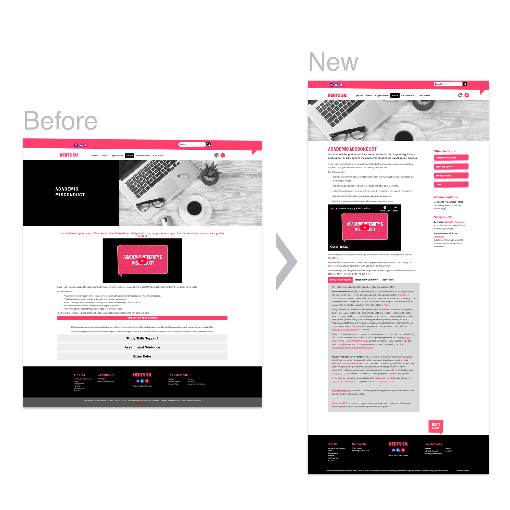
- Added sidebar navigation to reduce clicks and highlight key info
- Delivered accessible, consistent layouts aligned with brand
Process
Research & audit
I started by reviewing the existing Students’ Union website, which contained outdated branding, broken links, and inconsistent navigation. The site structure was cluttered with accordions, sliders, tables, and overlapping content. I mapped out the information, identified redundancies, and created a rule system to guide how content would be displayed in line with the Union’s branding.
Design
Using Figma, I developed new layouts that simplified the site structure while maintaining consistency with other Union materials. I focused on making content easier to scan and navigation clearer. Supporting elements were created in Photoshop and Illustrator to align with the visual identity.
Collaboration
Throughout the project, I worked closely with the marketing team and in-house graphic designer. Feedback was gathered iteratively, ensuring the design met both student needs and internal requirements. The project also required balancing different stakeholder priorities across the Union.
Implementation
Once the designs were approved, I built the site within the MSL content management system using HTML, CSS, and JavaScript. The build combined coded components with editable templates so multiple staff members could update pages. I also produced a training document to help staff manage content consistently going forward.
Key design decisions
- Expanded the homepage to highlight a wider range of Union services beyond events.
- Introduced sidebar navigation on information-heavy pages, reducing the number of clicks needed to reach sub-sections.
- Used sidebars to surface important details such as service opening hours, preventing duplication across pages.
- Consolidated small pages (for example, the Advice team) into sidebars to reduce unnecessary clicks and streamline navigation.
Outcome
The redesigned site was cleaner, more consistent, and easier for students to use. Information that previously required several clicks was accessible from a sidebar. The updated structure reduced clutter and made services beyond events more visible. Accessibility was improved through updated coding practices, making the site more suitable for screen readers. Finally, editable templates gave the Students’ Union team the ability to maintain the site more effectively.

