Brand identity for Graphic icing
Graphic Icing was the freelance design business I founded, offering both graphic and web design services. The brief for this project was to create a brand identity that stood apart from traditional agencies, presenting a fun, approachable, and memorable personality. The business needed an identity that reflected creativity and clarity while also working across print, digital, and merchandise.”
The name and concept came from a simple metaphor: branding is like icing on cakes. Just as icing gives identical cakes their unique look, a strong visual identity helps businesses differentiate themselves and connect with their audience. This idea shaped the design process of this project, from early logo sketches inspired by piped icing through to the final brand. The result was a colourful and versatile identity that reinforced the business’s mission to make design easy to understand and accessible for every client.
Highlights
- Created a brand identity from scratch, starting with only a name and concept
- Used Adobe Illustrator, Photoshop, and InDesign to develop the logo and supporting assets,
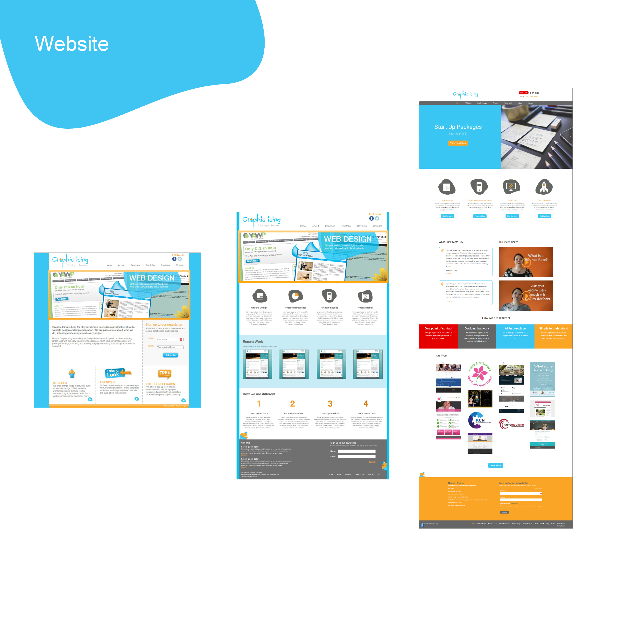
- Built a custom WordPress theme for the website
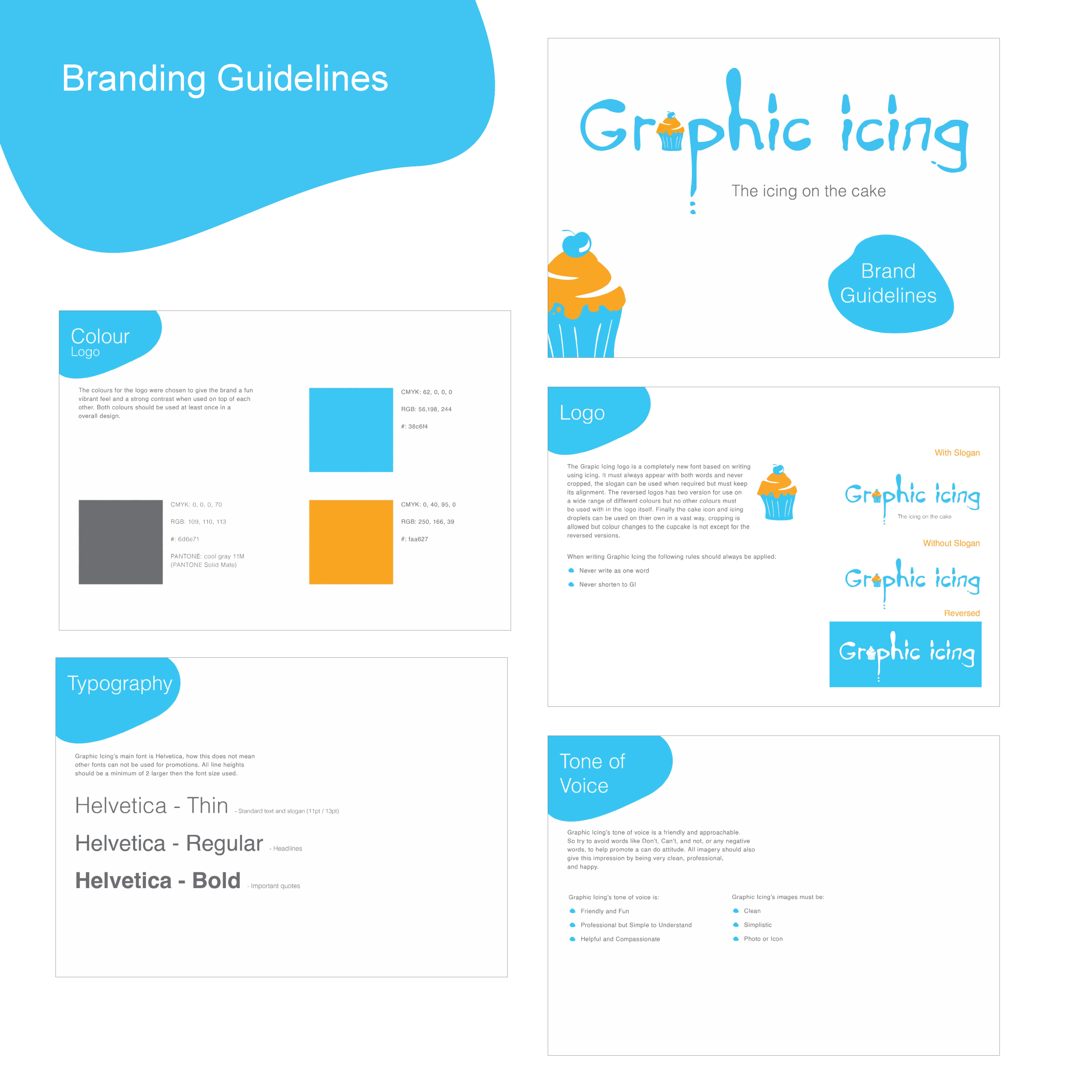
- Delivered brand guidelines to ensure consistency across digital and print materials
- Delivered a brand that remained memorable and received positive feedback for over 10 years
Process
Research & Concept
The Graphic Icing identity began with a clear aim, to create a brand that stood apart from traditional design businesses. The name and idea came from the metaphor around how icing makes otherwise identical cakes distinct, like branding gives businesses their unique look. I researched how other local agencies presented themselves and how they used their branding and saw an opportunity to position the business as approachable, jargon-free, and client-focused, with this fun unique branding identity.
Design
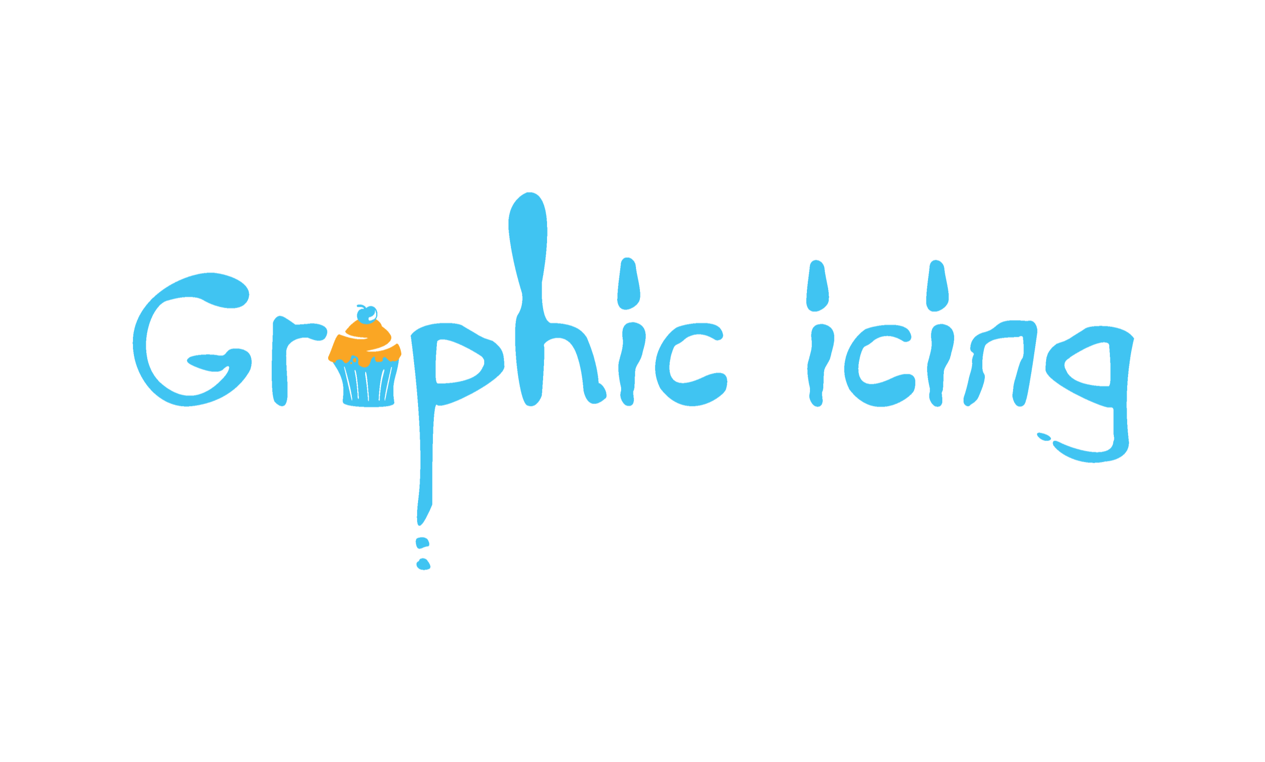
I started by creating hand-drawn lettering by piping icing on paper, which I scanned and vectorised in Adobe Illustrator. The supporting visual language was built around icing blobs and the bright blue and orange colour palette, chosen to convey friendliness and creativity. Helvetica was selected as the secondary typeface for its familiarity, balance, and clarity. These elements created an identity that was fun and creative.
Collaboration
As both designer and client, I faced the challenge of staying objective. To counter this, I would audit the current designs against the target audience and I sought feedback from existing clients and other businesses, testing logo drafts and colour options to ensure the brand felt approachable and memorable rather than self-indulgent.
Implementation
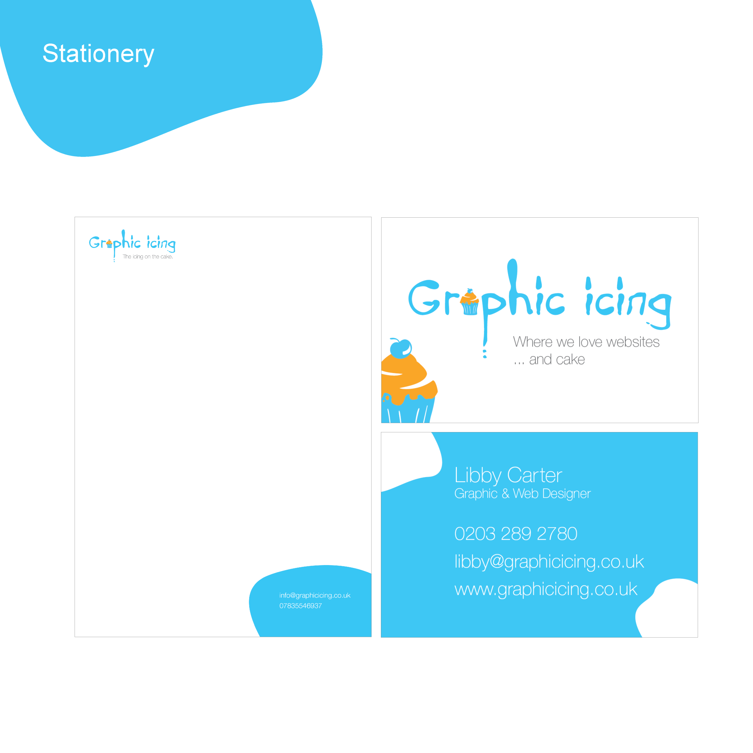
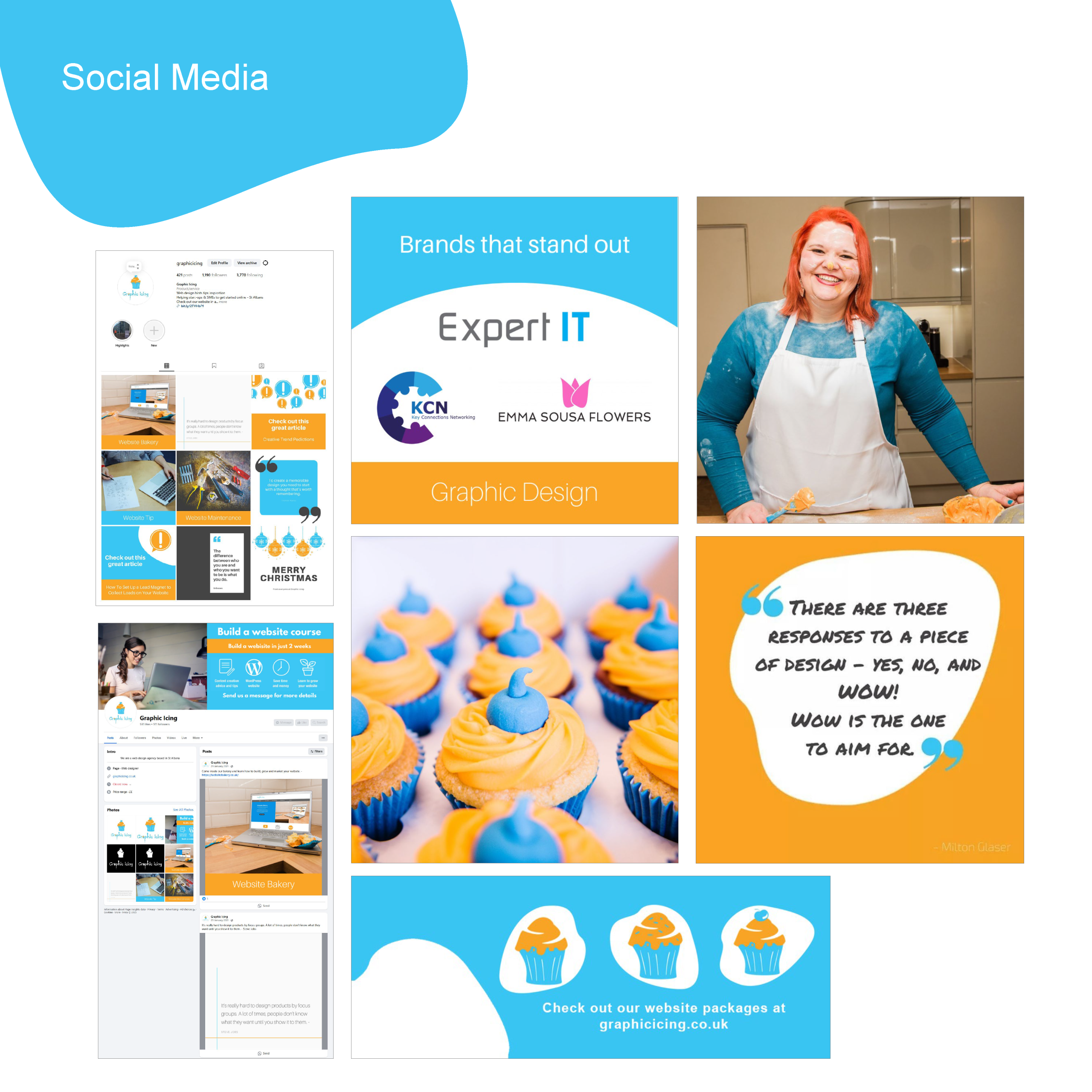
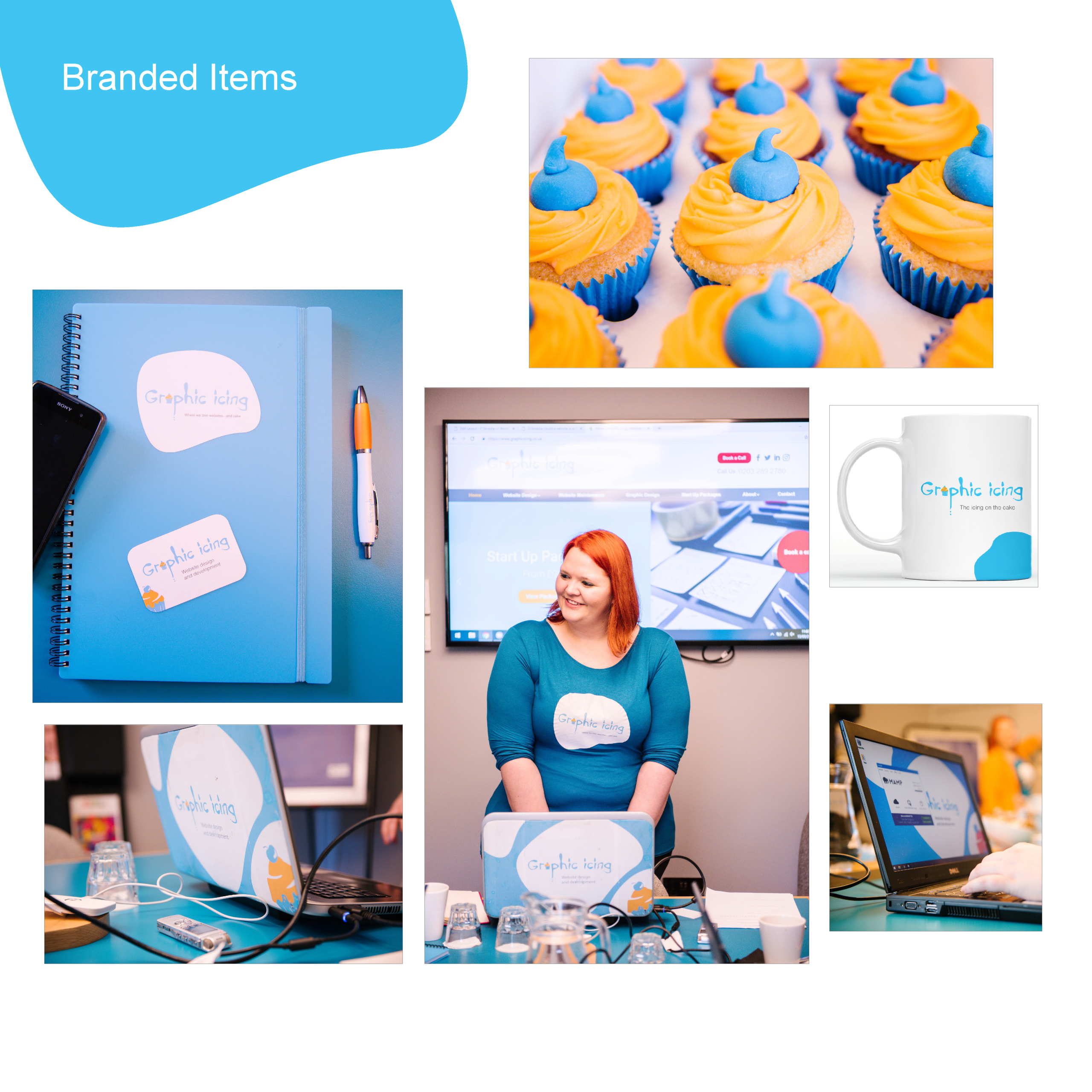
Once finalised, the brand was documented in guidelines covering colour use, typography, and logo applications. I created variations of the logo for use on coloured backgrounds and an icon only version for smaller spaces. The identity was then applied across stationery, business cards, website (built with a custom WordPress theme), social media graphics, and merchandise including mugs, pens, and t-shirts.
Development
During the 10 years the branding was in use, I conducted regular branding audits resulting in upgrading and sometimes tightening of the branding guidelines. The website was also fully redesigned on 2 separate occasions due to the business expanding and the streamlining of the brand identity.
Key design decisions
- Developed logo from hand-drawn icing-inspired letterforms.
- Chose blue and orange palette to represent friendliness and creativity.
- Created brand guidelines to ensure consistency across media.
- Positioned the brand identity to reflect an approachable, jargon-free ethos.
- Selected Helvetica as the supporting font for its balance, familiarity, and trustworthiness. Its clean, uncomplicated style ensured it complemented rather than competed with the logo.
Outcome
The Graphic Icing brand successfully delivered on its goal of being approachable, memorable, and creative. The identity stood out from competitors and consistently attracted positive feedback, with clients often commenting on how distinct and professional it looked. Many enquiries came directly as a result of the branding being noticed, showing its effectiveness as both a marketing and design tool.
The brand proved versatile, working across print, digital, and merchandise applications without losing consistency. It also reinforced the company’s jargon-free ethos, making the services feel accessible to a wide range of clients. The identity remained in use for over 10 years, continuing to be recognised and complimented long after its launch.

